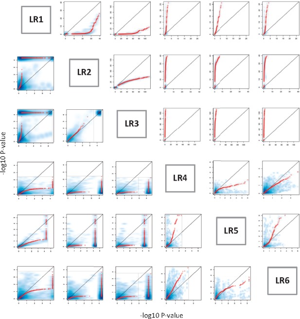
Fig. 2.

The comparison between different epistasis models using simulation dataset. The x and y axes represent –log10 P-value of the interaction term from a pair of models. The red dot is the QQplot and the blue shadow is a smoothed density representation of the scatterplot between two models. The upper triangle represents the QQplot of original P-values, and the lower triangle represents the QQplot of empirical P-values
