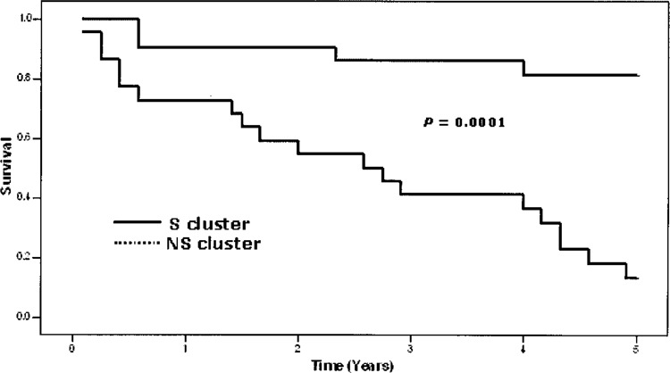
Figure 1.

Kaplan-Meier curves showing the patient survival rates for the two clusters generated by the hierarchical clustering analysis based on 218 differentially expressed genes. The upper unbroken line represents the 22 patients in the S cluster, whereas the lower dotted line represents 21 of the 23 patients in the NS cluster. Two patients belonging to the NS cluster were known to be nonsurvivors, but the exact survival time had not been recorded. They were excluded from the diagram. The difference in survival rate between the two clusters is statistically highly significant (p = 0.0001) (7).
