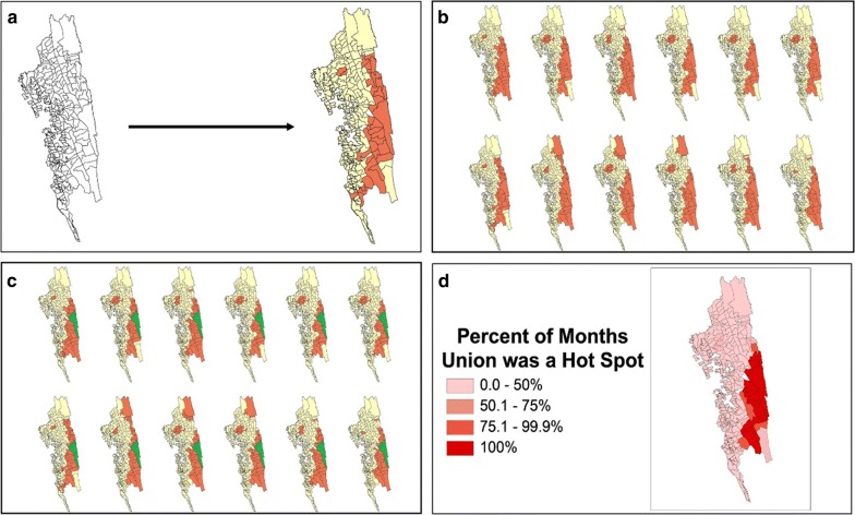
Fig. 4.
Depiction of the stability map production process. The four panels show an example of how a stability map was produced from monthly incidence data for 1 year. a Hotspot analysis for 1 month. The Getis-Ord Gi* statistical technique identifies hotspots of malaria incidence to a 95% confidence level (marked in orange). The features that are not statistically significant hotspots are marked in yellow. b Monthly hotspots for each month in the year. The Getis-Ord Gi* technique identifies hotspots for each month of the year in question. c Hotspot stability identification. Each geographical area is examined for how many months it was identified to be a hotspot in the year. For example, Farua, the area highlighted in green, was a hotspot for all 12 months of the year. Therefore, the percent of months the union was a Hotspot is 100%. d Stability map depiction. The amount of time each geographic area was a hotspot is displayed on a map. Farua can be seen shaded in the deepest red, indicating it was a hotspot for 100% of that year

