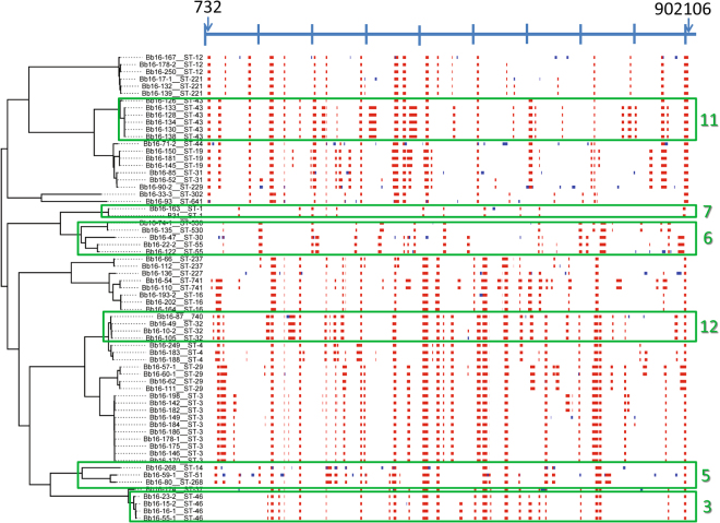
Figure 4.
Output from Gubbins analysis showing a map of possible regions of recombination. The scale bar at the top of the map shows the length of the chromosome (with tick marks every 100 Kb) and arrows indicate the first and last position where recombination events were detected. The analysis included all sequences obtained in this study. Red regions are those that are common to multiple strains, the blue regions are those found only in one strain, and white areas indicate where recombination was not detected. Green boxes illustrate some of the clades that had patterns of recombination loci that were similar within-clade but different to adjacent clades. The numbers refer to the numbering of clades in the phylogenetic tree in Fig. 6.

