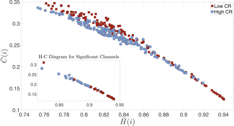
Figure 7.
Complexity-Entropy Diagram. Diagram of subjects’ average complexity vs. entropy for all 148 nodes (i.e., each point represents a node). Red squares correspond to low CR group and blue circles to the high CR group. The inset shows only nodes with statistical significant differences using the permutation test. Specifically, these nodes are the channels that have statistical differences when comparing both the mean entropies and complexities of high vs. low CR groups at node level. See Supp. Info. for similar results obtained with the rank-sum test.

