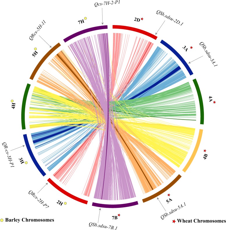
FIGURE 4.
Comparative analysis showing synteny in spot blotch resistance QTLs mapped on wheat (TGACv1 2014) and barley (Mascher et al., 2017) chromosomes. The map was made using CIRCOS (Circular Genome Data Visualization). Each color indicates a different chromosome. Arcs in bold shows the corresponding marker related to the respective QTL.

