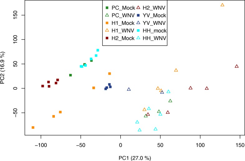
Fig. 2.

Principal component plot of the five datasets included in group 1 (neurological tissues). The axes show the first two principal components with the amount of variance these components explain from the original data. Studies are represented by different colors, WNV-infected samples are displayed as triangles, mock-infected samples as squares. The plot shows a clear separation of infected and control samples in the first principal component
