
Figure 4.
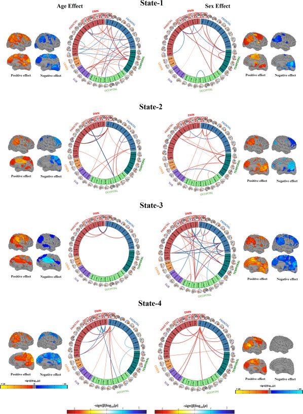
Connectogram and rendering maps showing age and sex associations across the dynamic connectivity states. Connectograms are sorted by major brain lobes. Rendering maps are divided into average positive and negative effects. For age analyses, red lines indicate positive association between a particular pairwise connection and age, whereas blue lines indicate a negative age association. For analyses of sex, red lines indicate where female subjects showed stronger connectivity than male subjects, and blue lines indicate where male subjects showed stronger connectivity compared to female subjects. All the results presented in the connectograms survived the false discovery rate (FDR) multiple comparison correction threshold of p FDR = .05 [Color figure can be viewed at http://wileyonlinelibrary.com]