
Figure 1.
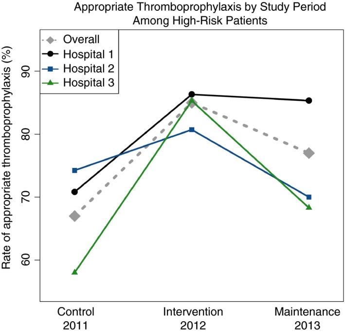
The grey dashed line represents the rate of appropriate thromboprophylaxis of all hospitals. The line with an embedded black dot, blue square, and green triangle represent the rate of appropriate thromboprophylaxis hospitals 1, 2, and 3, respectively