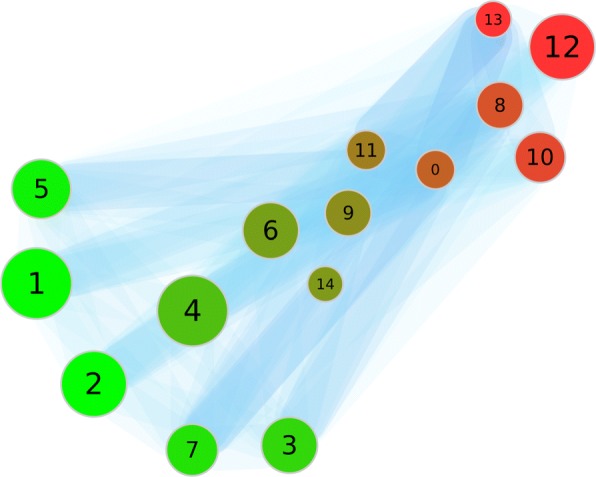
Fig. 6.

The partition of the first dataset with the distance d2. This picture shows the weighted graph of the clustering. The colors of the nodes indicate a high rate of documents from the respective queries (red: ’escherichia AND pili’; green ’cerevisiae AND cdc*’). The numbers identify the clusters. The size of a node scales with the number of documents inside. The edges and their width and color describe their weight. A blue edge has a greater weight
