
Figure 2.
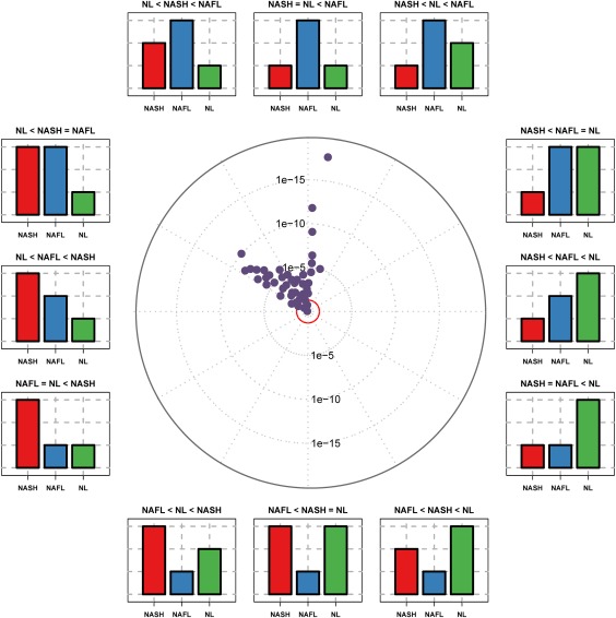
Triglyceride distribution in the discrimination among patients with NL, NAFL and NASH: ANOVA plot representation. The ANOVA plot is a scatter plot of the negative log10‐transformed P values from the ANOVA test. This ANOVA plot is a variation of the volcano plot and represents the effect of the TGs studied in three categories (NL, NAFL, and NASH). The distance of a TG from the center indicates its significance in the test. The position in the circle indicates the effect of each TG in the three diagnostic categories represented by the bar plots. TGs outside the inner red circle are P < 0.05. Abbreviation: ANOVA, analysis of variance.