
Figure 5.
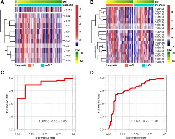
NAFLD serum metabolic profile for the discrimination between NL and NAFLD and between NAFL and NASH in the validation cohort. Obesity‐dependent metabolic profile of the 28 TGs that participate in the discrimination among NL, NAFL and NASH for the patients included in the validation cohort. (A,B) Heatmap representation of the serum metabolic profile obtained from 192 patients with NL (7), NAFL (109), and NASH (76) included in the validation cohort. Each data point corresponds to the relative ion abundance of a given TG (vertical axis) in an individual patient's serum with respect to that found in the rest of the study population, 0 being the mean value. For each heatmap, log‐transformed ion abundance ratios (A) NAFLD versus NL and (B) NASH versus NAFL are depicted, as represented by the scales, where blue represents a decrease in TG abundance in NAFLD versus NL and NASH versus NAFL and red represents an increase in TG abundance. (C,D) AUROC curves calculated (C) NAFLD versus NL and (D) NASH versus NAFL.