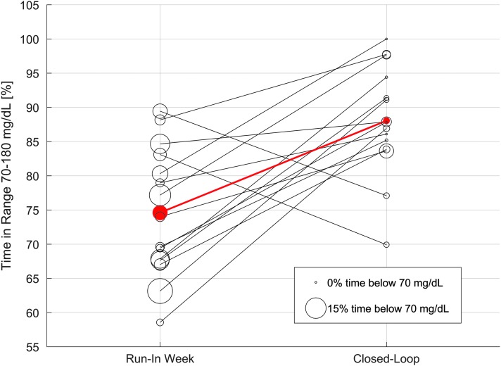
FIG. 4.
Individual metric improvement. Every line represents a participant in the AP study. Progress from the SAP run-in week to the AP system can be read from left to right in the plot. Bubble size represents the time spent below 70 mg/dL. The red line and circles represent mean values. SAP, sensor-augmented pump. (Color graphics available at www.liebertonline.com/dia)

