
Figure 1.
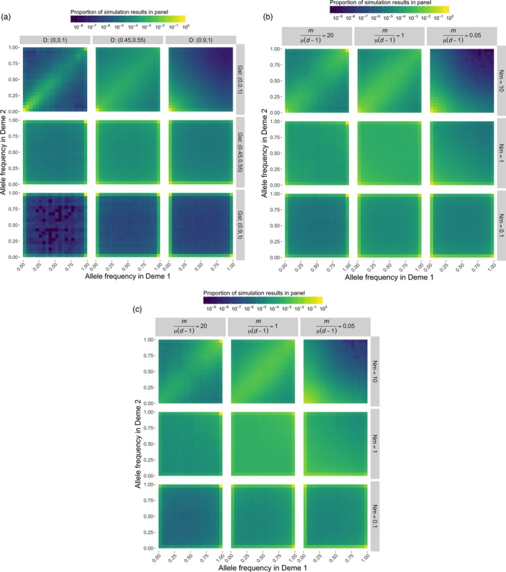
Heatmaps presenting the joint allele frequency spectrum under various evolutionary scenarios. We run 1,000 replicates for each evolutionary scenario consisting of different combinations of (a) D and GST, and (b,c) m/μ(d−1) and Nm values for a single locus evolving under the infinite‐allele model. In a and b, the color represents the proportion of simulation results for which the frequency of distinct alleles is x in deme 1 and y in deme 2. In c, the points from b have been weighted by the mean allele frequency to downweight rare alleles. Note that as opposed to a typical joint allele frequency plot that presents the derived allele frequency for bi‐allelic loci, here we consider the frequencies of all distinct alleles at a locus. Furthermore, the plots comprise all pairwise combinations of demes. When allelic differentiation is low, most of the simulation runs will yield points that lie close to the line x = y, indicating allele frequencies are about the same in both demes. When allelic differentiation is high, allele frequencies are concentrated along the x‐ and y‐axes, indicating allele frequencies are near zero in one of the two demes. Fixation is indicated when the points occupy the upper or rightmost edges of the panels (the lines x = 1 or y = 1). The plots show that high values of GST indicate a high degree of fixation. A full description of the demographic parameters used and simulation methods are given in Supporting Information