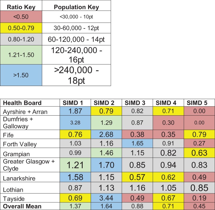
Table 3.
Share of practices in each quintile versus percentage share of Data Zones within each quintile (columns) for different Health Boards (rows)
 |
The data are expressed as a ratio quotient (%practices / %Data Zones). Red cells represent areas of low practice density. Blue cells indicate areas of high practice density. Colour-coding is in online version of manuscript only. Larger font sizes denote areas with higher populations.
