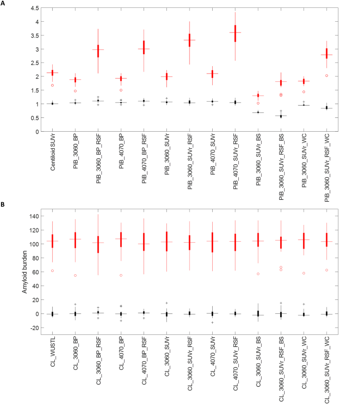
Fig. 1.
Box plot of amyloid burden measurements for the GAAIN dataset before (A) and after (B) converting to the Centiloid scale. YC data are shown in black and AD data are shown in red. The same 13 versions of the amyloid burden measurements summarized in Table 1 were included in this figure. Binding potential data are presented as BP + 1 in (A) to allow better comparison with SUVr measurements.

