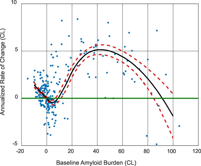
Fig. 4.
The annualized rate of change as a function of baseline amyloid burden. Dots are the raw data points, black solid lines are the average curve and red dash lines are 95% CI (based on bootstrapping). Note the minimum of the black curve (even the upper 95% CI curve) had a negative rate of change.

