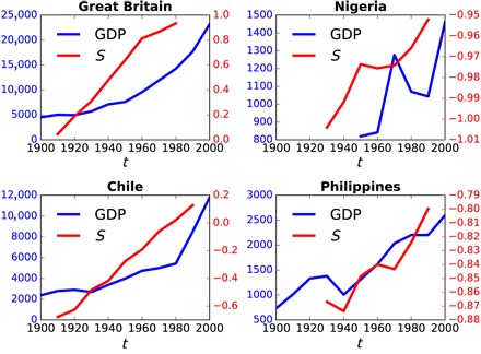
Fig. 2. Time series of secularization versus GDP per capita, from four illustrative countries, over the 20th century.

Each red line represents the mean secularization score, St, of the birth cohort in decade, t, for that country. Each blue line represents the mean GDP per capita (normalized to 1990 US$) during decade t in that country.
