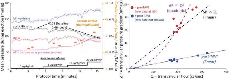
Figure 2.
Example haemodynamic data and analysis. The left panel depicts several haemodynamic parameters during the time-course of the protocol. Each small dot represents the systolic ejection portion of a single cardiac cycle, as in Figure1, with a superimposed trend line. Thermodilution cardiac output measurements (orange dots) were made twice during each stage of dobutamine infusion. The right panel demonstrates how each measurement of cardiac output and mean transvalvular gradient (ΔP) was transformed into a single point, creating a pressure loss vs. flow curve. In this example, the shape of the curve before transcatheter aortic valve implantation is neither quadratic (as assumed by the Gorlin orifice model) nor linear (as for a resistor), but instead a mixture of the two. However, after transcatheter aortic valve implantation (raw data not shown but provided in the Supplementary material online and similar in concept to the left panel) the points fall on a straight line through the origin, implying a constant valve resistance.

