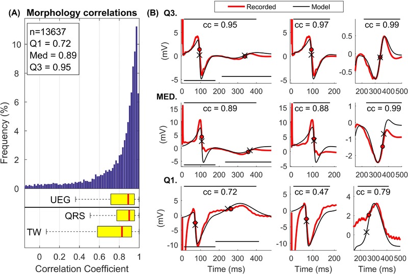
Figure 3.

A, Distribution of the correlation coefficients indicating the morphological similarity between recorded and simulated UEGs. Correlations were considered within the entire signal (indicated as UEG in the figure) as well as within the QRS and the T‐wave, separately. B, Representative examples of recorded (red) and simulated (black) UEGs corresponding to correlation coefficients equal to the first (Q1), second (MED), and third (Q3) quartile. The correlation coefficients are calculated within the entire signal (left), within the QRS (middle), and the T‐wave (right), and the panels are adjusted to highlight the correlation within these intervals [Color figure can be viewed at http://wileyonlinelibrary.com]
