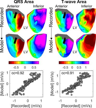
Figure 4.

Representative example of morphological similarity between recorded and simulated unipolar electrograms (UEG). Color maps show the area under the QRS complexes (left) and T‐waves (right) of UEGs recorded in one patient (top, anterior view on the left, inferior view on the right) and in the corresponding simulated UEGs (below). The black line on the ventricular mesh indicates the approximate location of the LAD. On the bottom, the scatterplots indicate high correlation between the recorded and simulated QRS area (left) and T‐waves (right) (correlation coefficient cc ≥ 0.91) [Color figure can be viewed at http://wileyonlinelibrary.com]
