. 2018 Jul 2;14(7):e8131. doi: 10.15252/msb.20178131

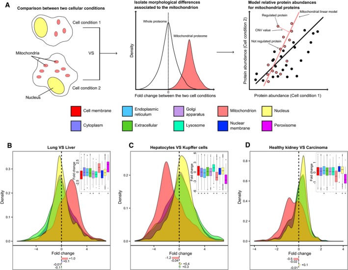
Figure 1. Differences in cellular organization emerge from quantitative proteomic experiments.

Figure 1

  • A
    Scheme of the analysis of cellular compartments based on modeling compartment‐normalized variation (CNV) values for proteins (shown for two hypothetical cell conditions displaying different numbers of mitochondria).
  • B–D
    Analysis of protein abundance shift in cellular compartments in published datasets. Density plots for protein fold change distributions in different compartments for (B) lung vs. liver cells (Geiger et al, 2013), (C) hepatocytes vs. Kupffer cells (Azimifar et al, 2014), and (D) healthy human kidney vs. renal carcinoma cells (Guo et al, 2015). Distribution of protein fold changes for 10 different compartments is shown as boxplot (inset); mean fold changes (log2) are indicated below the density plots; below the boxplot, asterisks mark the cellular compartments that show significantly different distribution of fold changes compared to the whole proteome (Mann–Whitney test *P < 0.01).
Data information: Boxplots: the horizontal line represents the median of the distribution, the upper and lower limit of the box indicate the first and third quartile, respectively, and whiskers extend 1.5 times the interquartile range from the limits of the box. Values outside this range are indicated as outlier points. Related to Figs EV1 and EV2 and Datasets EV1, EV2 and EV3.