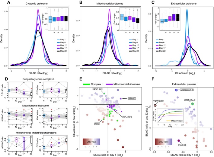
Figure 3. Remodeling of the mitochondrial and extracellular proteome during Caenorhabditis elegans aging.

-
A–CAnalysis of the abundance distribution for (A) cytoplasmic, (B) mitochondrial, and (C) extracellular proteins across five age groups in C. elegans (Walther et al, 2015). Each age group was compared against a pool reference sample using SILAC (Ong et al, 2002). Distribution of protein fold changes for the different time points is shown as density plots and as boxplots (inset); below the boxplots, asterisks mark the time points that show significantly different distribution of fold changes compared to the first time point (Mann–Whitney test *P < 0.01).
-
DAbundance variation of complex members for three mitochondrial complexes (respiratory complex I, mitochondrial ribosome, and mitochondrial import/export proteins). For each complex, the abundance variation of each member (colored in gray) over the five age groups is reported with the Δ SILAC ratio (difference between the experimental SILAC ratio of a time point and the SILAC ratio at day 1, left) and the CNV value (right). For each age group, the boxplot (colored as the corresponding time point in the panels A–C) represents the variance between the abundances of the complex members. Significant changes (Mann–Whitney test P < 0.05) are marked with a red star.
-
EVariation of the mitochondrial proteome over the lifespan of C. elegans (day 1 and day 22). Respiratory chain complex I and mitochondrial ribosomal proteins are highlighted in green and purple, respectively (selected proteins, with extreme CNV values, are indicated).
-
FVariation of the extracellular proteome abundance over the lifespan of C. elegans (day 1 and day 22). Four proteins have been selected (highlighted with a colored circle: purple for NAS‐34, green for Y45F10C.4, blue for Vitellogenin‐1, and black for Y45F10C.2) for their slower or accelerated increase in abundance compared to the rest of extracellular proteins. The variation of the selected proteins (highlighted with the same colors) throughout the worm lifespan is represented in the middle box, with the average of the extracellular proteome colored in yellow.
