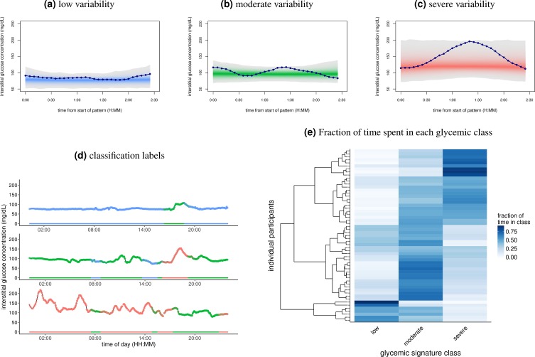
Fig 2. Classification of CGM with classes of glycemic signatures.
(A-C) Segregation of the 2.5-hour windows into the three classes of glycemic signatures derived from spectral clustering. The lines in each panel show an example of the glycemic signatures in each class. This separation of windows explains approximately 73% of the variance. (D) One day of CGM data for 3 separate individuals. Color indicates classification of glycemic signatures. Note that since overlapping windows were used for clustering and classification, some periods of the day have multiple classifications. (E) Heat map showing the fraction of time individuals spent in each of the glycemic classes. Rows represent unique individuals in the cohort, while columns represent each of the glycemic signature classes shown in A-C. Color of the tiles corresponds to the fraction of time spent in each class, with 1 being 100% of the time. There were 238 windows per participant (S3 Data). Rows of individuals are arranged according to hierarchical clustering. CGM, continuous glucose monitoring.

