
Figure 4.
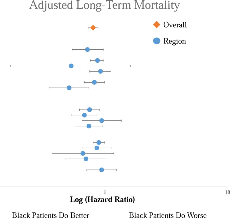
Forest Plot of the Hazard Ratios for the adjusted long-term mortality risk for Black patients compared to White patients by region. Top line is the overall cohort, each subsequent line represents an individual region. No significant difference across regions.