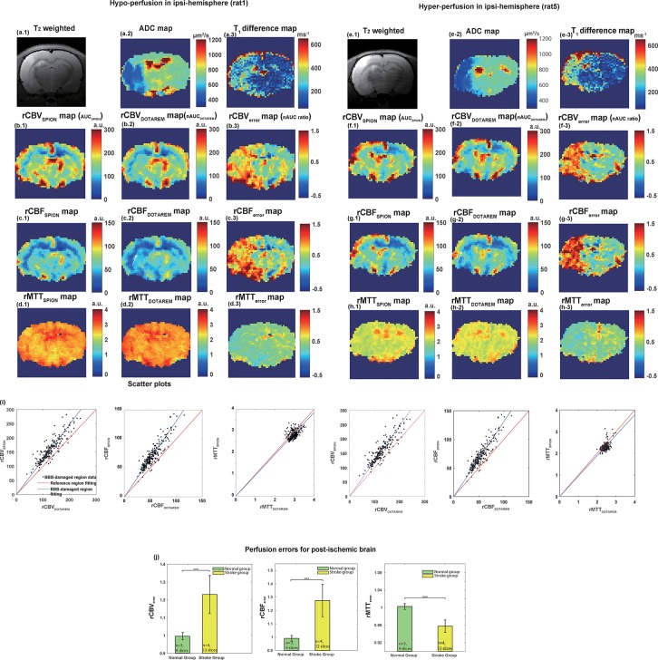
Fig 3. Results of in vivo experiment on two stroke rats with local hypo- and hyper-perfusion.
(a.1, e.1) T2-weighted images, (a.2, e.2) ADC maps, and (a.3, e.3) T1 map difference between pre- and post-Dotarem injection. (b.1, f.1) and (b.2, f.2) show the rCBVSPION (AUCSPION) and rCBVDotarem (nAUCDotarem), respectively. (b.3, f.3) show the associated rCBVerror (nAUC ratio). (c.1, g.1) and (c.2, g.2) show the rCBFSPION and rCBFDotarem, respectively. (c.3, g.3) show the associated rCBFerror. (d.1, h.1) and (d.2, h.2) show the rMTTSPION and rMTTDotarem, respectively. (d.3, h.3) show the associated rMTTerror. (i) Respective scatter plots of rCBVSPION/rCBVDotarem, rCBFSPION/rCBFDotarem, and rMTTSPION/rMTTDotarem in the damaged BBB ipsi-lesional hemisphere of stroke (black dots). The red and blue lines are fitted lines for the contralateral hemisphere and the BBB-disrupted lesion, respectively. (j) Respective statistical analysis of corresponding perfusion parameters. The green and yellow bar graphs represent the values from the normal (n = 3 with 9 slices) and stroke groups (n = 4 with 12 slices), respectively. a.u. means arbitrary unit.

