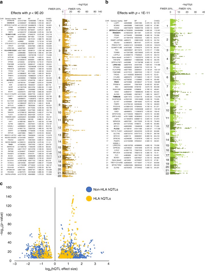
Fig. 1.
hQTL Manhattan plots and plot of hQTL effect sizes. Top effects for a the H3K27ac mark (p < 1E−30, vertical gray line), and b the H3K4me1 mark (p , < 1E−15, vertical gray line) are indicated. Strongest effects for each mark are in bold. Red vertical line indicates the 10% FWER threshold (nominal p , = , 8.9E−07); blue vertical line indicates the 20% FWER threshold (nominal p = 9.8E−07). Y-axis is the −log10 (p) from the CHT; chromosome position is plotted on the x-axis. c Volcano plot of the hQTL effect sizes. The log2(effect size) is plotted on the x-axis where values >0 had more reference than alternate allele specific reads and those with effect size values <0 had more alternate than reference allele specific reads. Y-axis is the −log10 (p) from the CHT. hQTLs located in the HLA region are in yellow and non-HLA hQTLs are in blue

