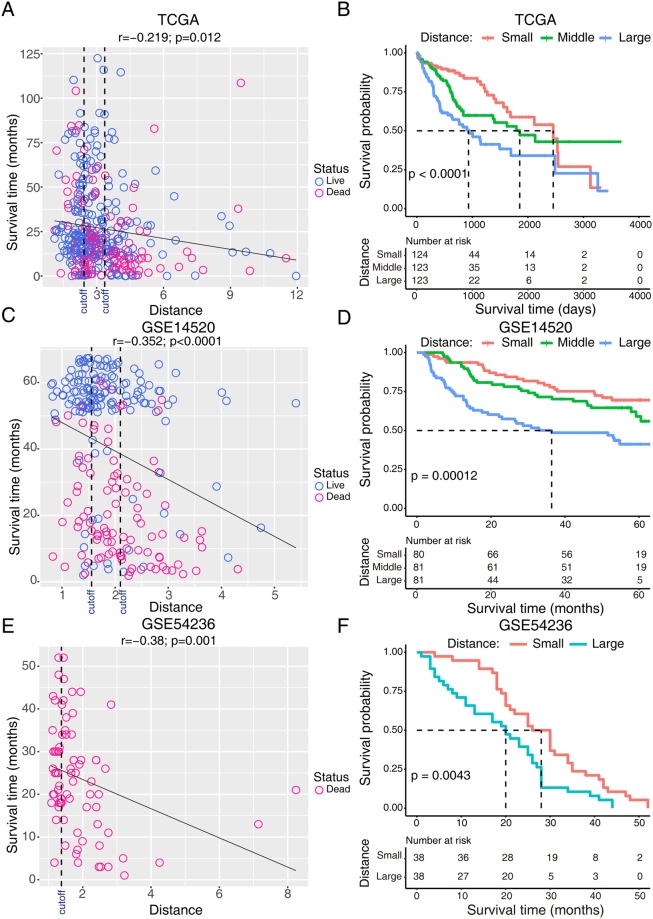
Figure 7.
Correlations between mean expression distance and the prognosis of patients with HCC. Scatterplots of survival time and mean expression distance in the (A) TCGA, (C) GSE14520, and (E) GSE54236, where survival time (y axis) is plotted against mean expression distance (x axis). Blue and pink represented patients with live or dead survival status, respectively. Black dashed line represents the cut-off value for dividing patients into different groups. The survival curves of different groups in the (B) TCGA, (D) GSE14520, and (F) GSE54236 datasets.

