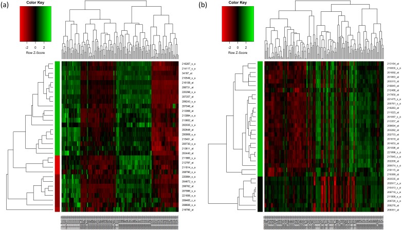
Figure 2. Hierarchical clustering of the selected genes.
(A) Hierarchical clustering of the 32 upregulated genes. (B) Hierarchical clustering of the 33 downregulated genes. In the figures, each gene is represented by the rows and the samples are represented by the columns. The dendogram at the side indicates the relation between the pattern of the gene expression while the top-dendogram indicates the relation between the samples used. The level of expression of the genes, relative to the mean of the gene across all samples, is indicated by the color key, with the green representing the higher expression of the genes. The color bar represents the cluster of the genes after they have been cut at 1.5 of the height of the tree so that the clustering of the genes is seen more clearly. The color of the bar is indicated by the color key similarly.

