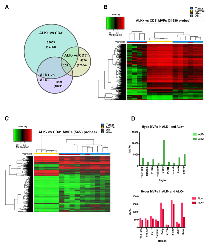
Figure 1. DNA Methylation of ALCL versus Normal CD3+ T Cells.
(A) Venn diagram showing significant MVPs (based on M values and adjusted p < 0.01) among indicated groups in comparisons of ALK+, ALK−, and normal CD3+. Numbers indicate unique MVPs of selected segments; numbers in parentheses indicate total number of MVPs of the three group comparisons: ALK+ versus CD3+, ALK− versus CD3+, and ALK+ versus ALK−.
(B) Hierarchical clustering of the top 31,580 differentially methylated CpG sites detected between ALK+ and control T cells (color key indicates percentage of methylation, from red = 100% methylation to green = 0% methylation). Sample annotation: blue, tumor; yellow, normal CD3+; red, ALK+ ALCL; green, ALK− ALCL.
(C) Hierarchical clustering of the top 5,453 MVPs detected in control T cells versus ALK− ALCL (color key and sample annotation as in B).
(D) Number and distribution of MVPs between CD3+ T cells and ALK+ or ALK− ALCL found at specific genomic regions and regions around CpG islands. Hypomethylated MVPs are shown at the top; hypermethylated MVPs are at the bottom. Differentially methylated sites were obtained after filtering the data (filtering criteria: adjusted p value < 0.01 and β-value difference > |0.2|).
See also Figures S1 and S2.

