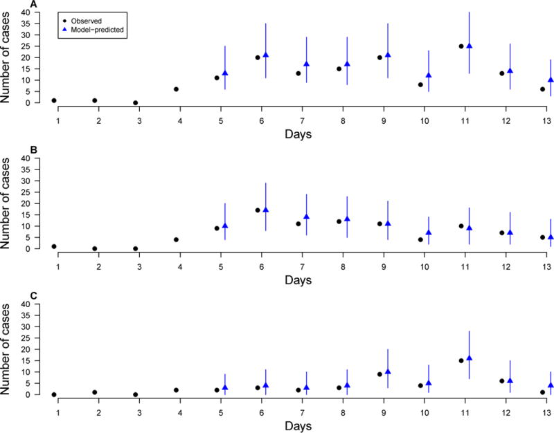
Figure 2.

Model-predicted daily numbers of symptom onsets (blue, triangle) versus observed numbers (black, circle) for different contact settings (A) Overall; (B) Urban households; (C) Rural households. The predicted numbers were generated by simulating the epidemics, conditioning on the cases of the first 4 days, for 10000 times, each time using a set of parameters sampled from their posterior distributions. Each blue vertical bar represents the 95% range and the blue dot represents the mean of simulated numbers.
