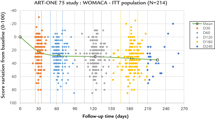
Figure 7.
Incidence of large versus small time windows. The scatter plot represents each patient observation as a point, giving the Western Ontario and McMaster Universities Osteoarthritis Index pain subscale A score variation to day 0 (y-axis) as a function of the exact time for each visit (x-axis). Each visit is color coded from day 0 to day 240. The small windows limits are represented by vertical lines, in same colors. For each group from day 30 to day 180, most of the points are within tolerances. For the points that are outside, most are above the upper limit, illustrating the tendency for an increased delay for the control visits by practitioners. There is a wide distribution of scores from very high (around 80) to negative (around –20), meaning that some patients have their pain totally relieved and a few others are worse. The points are distributed in horizontal lines every 5 score units, just because the Likert scale has been used (21 scores on the whole scale 0–100): This is not an artifact. One advantage of the reclassification within large windows is that no overlapping of the visits was possible. The center of gravity of each group (average score / average time) is represented by a circle, and the line linking them compares with the previous graph (see Figure 6). This line, which is flat above day 60, confirms the score stability with time. A small time shift can be seen between the average and the target time, which is not significant. The removal of all scores obtained outside the time limits cannot alter or improve the clinical results, confirming that the acceptance of these scores does not create any bias. The extra day 240 group has an average close to day 226, meaning 7.5 months rather than 8 months. D = day; ITT = intention to treat.

