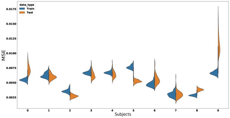
Figure 9.
This figure illustrates the MSE for every subject in the experiments. Each number in the x-axis from 1 to 7 represents a subject in the experiments. Violin plots 7, 8, and 9 were of two 15 degree incline walks and to all subjects’ signals combined, respectively. Every violin plot consists of two distributions (i.e., Train—blue and Test—orange ) and the mean of the MSE. The distributions illustrate the MSE variance over 100 runs. This figure shows that the ED-FNN managed to accurately predict the gait cycle over several subjects.

