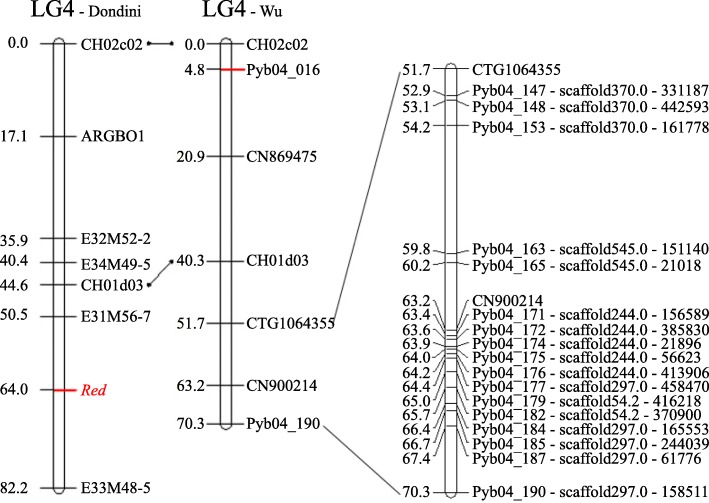
Fig. 2.
Comparison between Dondini’s LG4 and Wu’s LG4. The left one shows the Red locus on LG4 in Dondini’s map (2008), the middle one is the simplified LG4 of Wu’s high density genetic map (2014), the right one was part of LG4 of Wu’s map that might contain the Red locus interval we estimated. The middle and the right maps were drawed according to the supplementary data of Wu’s article, and the physical positions of the SNP markers were also added to themselves.

