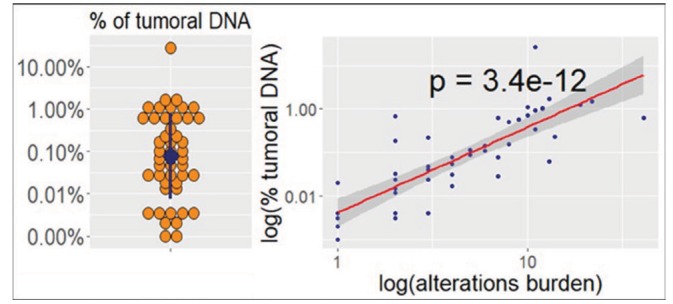
Figure 1.

Distribution of cell free tumour DNA between liquid biopsy next generation sequencing samples and correlation with alterations burden. In the dot plot (left), the blue dot and the blue line represent, respectively, the median and the 25th to 75th percentiles range. In the scatterplot (right), X axis and Y axis are inverted.
