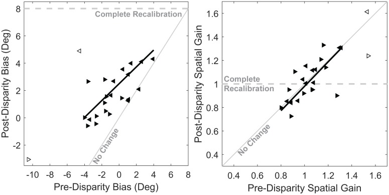
Fig 4. Pre- and post-disparity comparison of auditory bias and gain.
left panel, Difference in bias between the pre-disparity and post-disparity blocks. Data from leftward and rightward disparity sessions are represented with leftward and rightward pointing arrows, respectively. The two hollow symbols represent one subject that was an apparent outlier, and was excluded from the line fit. Data from leftward disparity sessions was mirrored through the origin to overlay rightward data. The dashed gray line represents where responses would fall if subjects completely compensated for encoded disparity, the solid gray line indicates where responses would fall if no change in bias was observed, and the solid dark line is a linear best fit. right panel, Difference in spatial gain between the pre-disparity and post-disparity blocks.

