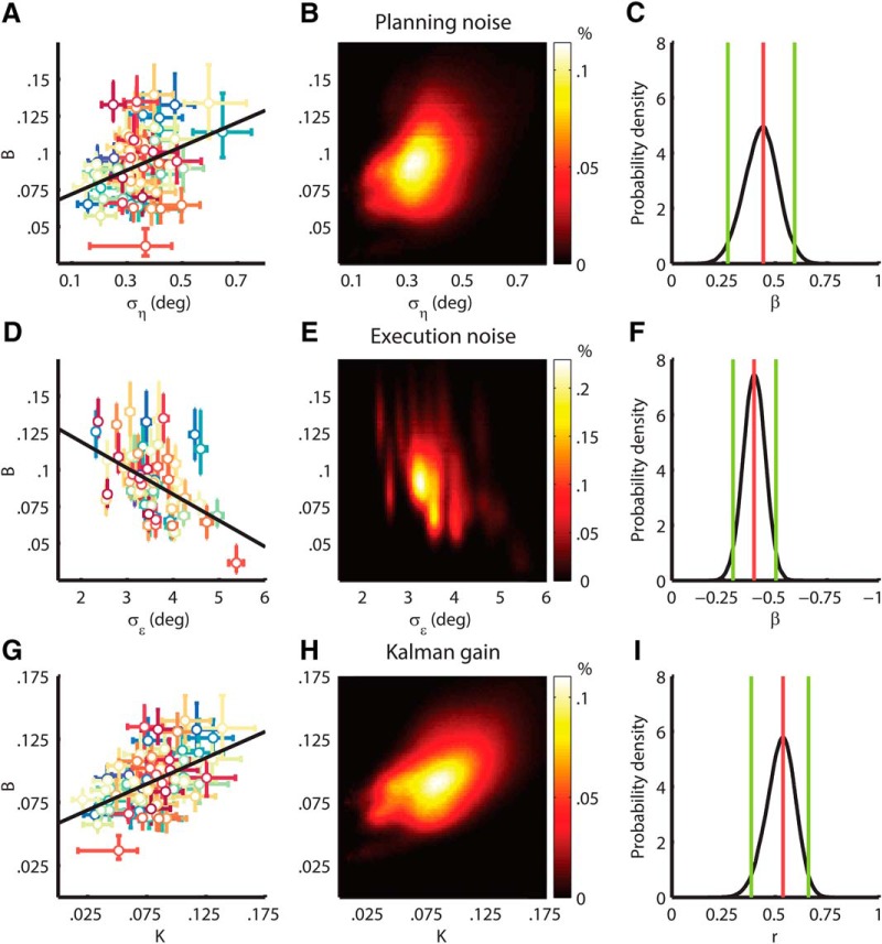
Figure 5.
Relation between noise and adaptation rate. A, D, G, Scatter plots of individual parameter estimates. Parameter estimates and 68% HDIs are shown for every subject as a dot with error bars. The black line is a linear regression of onto and for average , a linear regression of onto and for average (D) and the correlation between and (G). B, E, H, Heatmaps of the parameter estimate distributions. The heatmaps illustrate the distribution of the parameter estimates for the entire population of 69 subjects. The intensity represents the percentage of samples in a specific range for (B) and (B), and (E), and and (H). C, F, I, Effect size densities. The black line represents the probability density of the regression coefficient for and (C), the regression coefficient for and (F), and the correlation coefficient for and (I). The green lines indicate the 95% HDIs. The red line shows the mode.

