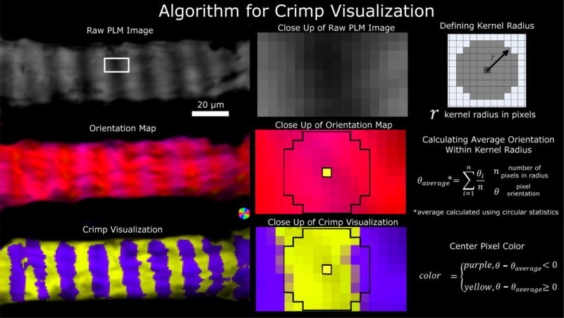
Figure 5. Crimp visualization algorithm.
A set of raw PLM images (top left) are used to calculate an orientation map (middle left). The orientations are further processed to simplify visualization of the crimp using yellow/purple bands (bottom left). The middle column shows close-ups of the LC beam region outlined in the white box in the top left panel. A kernel radius was defined (top right) and used to calculate the local average orientation (middle right). The center pixel was colored yellow or purple depending on the relative orientation of the pixel relative to the average orientation within the local kernel region (bottom right). A neighborhood of 4 pixels is shown in the close up of the orientation map and of the crimp visualization. The process is repeated for all pixels, then the pixel intensity scaled by the energy.

