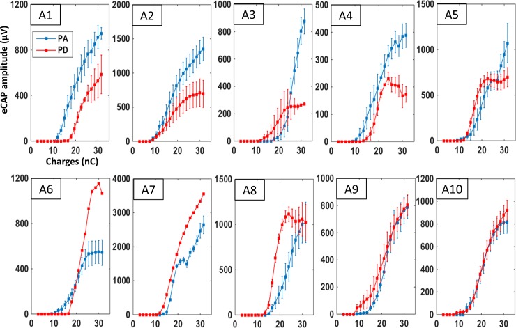
Fig 5. Individual mean growth functions for the eCAP amplitude in acute animals.
Each graph shows the mean (±SEM) eCAP amplitude as charge increases for one of the acute animals (A1-A10). Each curve was built with 4–8 acquisition protocols in a given animal. Blue curves represent eCAP amplitudes measured when charges were increased by an increase of pulse amplitude and red curves represent eCAP amplitudes measured when charges were increased by increasing the pulse duration. The evolution of these two curves markedly differed between animals. Note that for some animals (A3, A5), the shapes of these two curves roughly follow those shown in the group data (Fig 4). In contrast, for other animals (e.g., A1, A6, A7) the two curves clearly differ from the group data (Fig 4).

