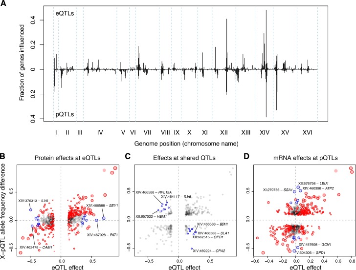
Figure 6. eQTLs and pQTLs.
(A) Distant eQTL and pQTL hotspots. The figure shows the fraction of 154 genes (Albert et al., 2014b) that have an eQTL or pQTL in a given bin along the genome. eQTLs from the current dataset are shown in the upper half of the figure, and pQTLs from (Albert et al., 2014b) are shown in the bottom half with an inverted scale. Chromosome III is omitted from the figure because no pQTLs can be detected on this chromosome due to the experimental design of (Albert et al., 2014b). (B–D) Comparison of individual distant eQTLs and pQTLs. Each panel shows the effect size of linkage of mRNA levels for a given gene to a given genomic position (x-axis; correlation coefficient between mRNA level and marker genotype) compared to the effect size of linkage of protein levels for the same gene to the same genomic position (y-axis; difference in frequency of the BY allele between segregant pools with high and low expression of the protein [Albert et al., 2014b]). Positive values indicate higher expression in RM compared to BY. Only distant QTLs located on different chromosomes than their target gene are shown. (B) All distant eQTLs, irrespective of significance in pQTL data. Dot size scales as a function of eQTL effect size. Red circles: eQTLs that overlap a significant pQTL. Blue circles: strong eQTLs that do not overlap a pQTL (Supplementary file 8); extreme cases are indicated by QTL location and the name of the affected gene. (C) Overlapping significant eQTLs and significant pQTLs. Blue circles: overlapping QTLs with different direction of effect (Supplementary file 9); extreme cases are indicated. (D) All distant pQTLs, irrespective of significance in eQTL data. Dot size scales as a function of pQTL effect size. Red circles: pQTLs that overlap a significant eQTL. Blue circles: strong pQTLs that do not overlap an eQTL (Supplementary file 10); extreme cases are indicated.

