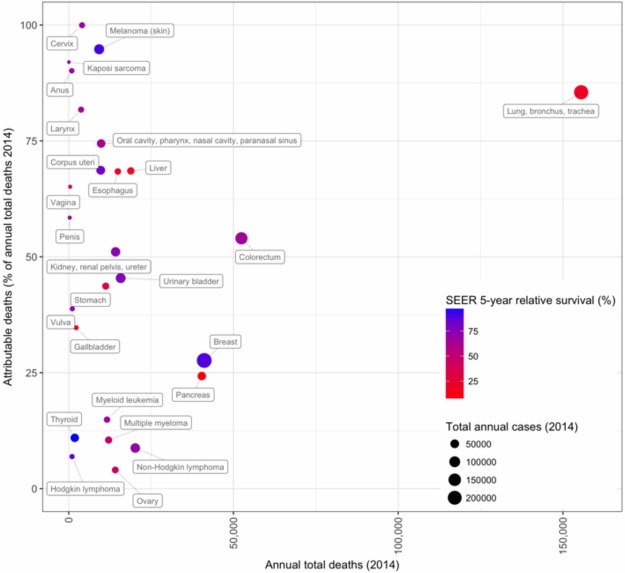
Figure 6.
Cancer deaths attributed to modifiable risks. Each anatomically categorized cancer was plotted by the current annual deaths due to that cancer (X-axis; total deaths in 2014) and the proportion of deaths attributable (and thus preventable by the elimination of risk factors) to the following modifiable risk factors: tobacco, UV exposure, infections, and Western lifestyle (Y-axis; PAF). Circle size is in proportion to cancer-specific incidence (incident cases, 2014), and colors are assigned by SEER 5-yr relative survival estimates (2007–2013; https://seer.cancer.gov/statfacts). Thus, although cancers of the breast and pancreas situate proximally, indicating an approximately equal number of total deaths and a similar PAF for the examined risk factors, breast cancer incidence is much higher (larger point size), and outcomes for breast cancer are far superior (bluish purple in color, indicating a >75% relative survival). Cancers (i.e., lung) shown in the top right are those for which we can achieve the greatest reduction in total cancer deaths by the population-wide adoption of healthy behaviors and policies, such as tobacco prevention/cessation or elimination. Cancers shown in the top left result in far fewer cancer-associated deaths but may be similarly profoundly reduced through population-wide adoption of healthy behaviors and policies (e.g., avoiding tobacco, cancer-associated infections, and harmful UV exposure). This figure was plotted based on data from Tables 2 and 4 of Islami et al. (2017) and from SEER (https://seer.cancer.gov/statfacts).

