
Figure 3.

The distributions of  -split scores for
 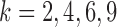 are shown. Scores were computed for all
  possible splits for a data set of 500 bp generated under the Jukes–Cantor model on the tree in Figure 1 with all branch lengths set to
  . These distributions are left-tailed, and the mean increases and the standard deviation (SD) decreases as
  increases. Behavior for other values of
  is similar. The red dots show the scores for the true
  -splits in the tree, which are the smallest in the data. (There are no
  -splits in the tree.) The blue line segment marks the mean. The
  -axis is the same on all subplots, but the
  -axis scales differ vastly because
  increases as
  varies from
  to
to  . (See online for color.)