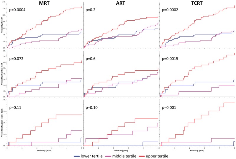
Figure 4.
Probabilities of follow-up events among survivors of acute myocardial infarction. The figure shows Kaplan–Meier curves of the probabilities of follow-up events among survivors of acute myocardial infarction stratified according to the spatial QRS-T angle. For each graph, the P-value of the χ2 test comparison of the probabilities is also shown. The blue, violet, and red curves correspond to patients with QRS-T angles within the smallest, middle, and largest tertile of the measurements, respectively. The top, middle, and bottom row correspond to the prediction of all-cause mortality, cardiac death, and sudden cardiac death, respectively. The left, middle, and right column correspond to the prediction based on the maximum R to T (MRT), area R to T (ART), and total cosine R to T (TCRT) calculations, respectively.

