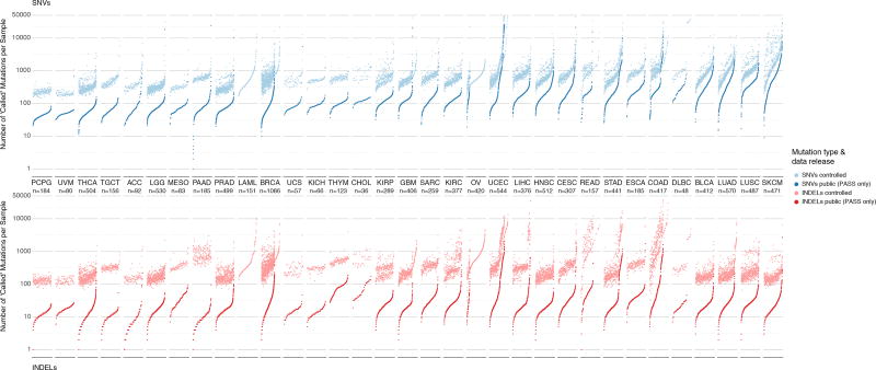
Figure 2. Distribution of mutations in controlled and open-access mutation files.
Two panels show mutation load for each sample in the dataset for SNVs (above) and indels (below). Each dot of the sorted scatter plots shows the total number of mutations pre- and post-filtering per sample. Total mutation counts are separated by total number SNVs (blue) and indels (red) per samples. Lighter colors indicate pre-filtered mutations from the controlled-access MAF, and deeper colors indicate post-filtered (PASS only) mutations from the open-access MAF. Cancers are ordered by the median number of post-filtered SNVs per tissue. Furthermore, samples are sorted by increasing number of total mutation count for SNV and indel plots respectively. Samples removed during post-filtering are also shown i.e. LAML and OV in lighter colors without an accompanying pair and are sorted accordingly. The total number of samples for each cancer type is displayed under each cancer label. Finally, Y-axis limits were placed from 0–50,000 for clarity. This resulted in the removal of 14 hypermutator samples from SNV plot and 10 hypermutator samples from the indel plot.

