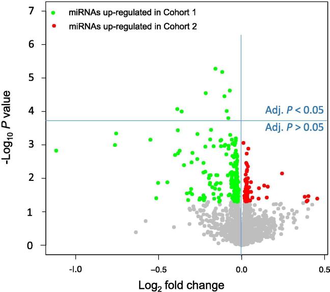
Figure 2.
Volcano plots for the pair-wise comparison of patients developing cancer and patients not developing cancer
Volcano plots show on the Y-axis the negative log10P value of the t-test and on the Y-axis the log2 fold change. Green dots indicate miRNAs with higher expression in blood samples from Cohort 1, while red dots represent miRNAs with higher expression in blood samples from Cohort 2 according to the raw P < 0.05. All dots with raw P ≥ 0.05 are colored in gray. The horizontal blue line separates miRNAs that are significant following Benjamini–Hochberg adjustment (above the line; adjusted P < 0.05) and miRNAs that are not significant anymore following the adjustment (below the line).

