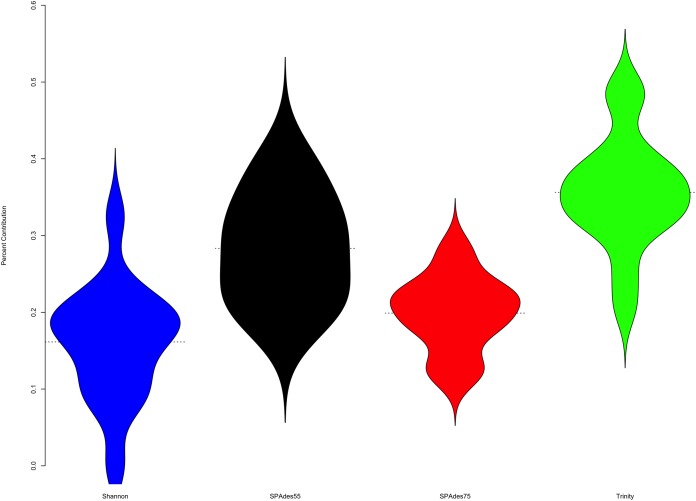
Figure 4. Plot describes the percent contribution of each assembler to the final ORP assembly.
The proportion of the final transcripts contained in the merged assembly that are a product of each assembler is shown. Violin plots illustrate that Shannon contributes on average the fewest number of transcripts (<20% of transcripts) to the final merged assembly, while Trinity contributes on average the most. Small dashed lines on each side of the plot mark the median of the distribution.

