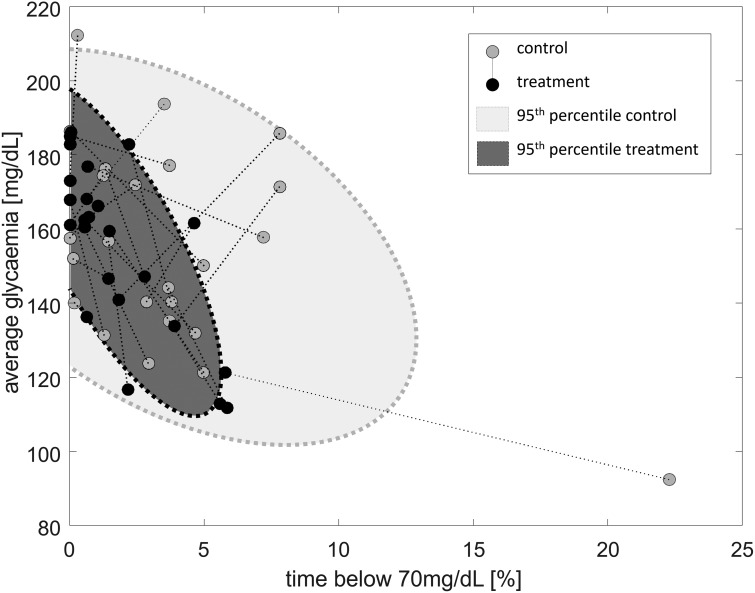
FIG. 2.
Evolution of average glycemia (Y-axis) and exposure to hypoglycemia (X-axis) from the control admission (gray circle) to the experimental admission (black circle). The gray areas with dotted perimeters represent the 95% confidence interval for the control (light gray) and experimental (dark gray) admissions.

