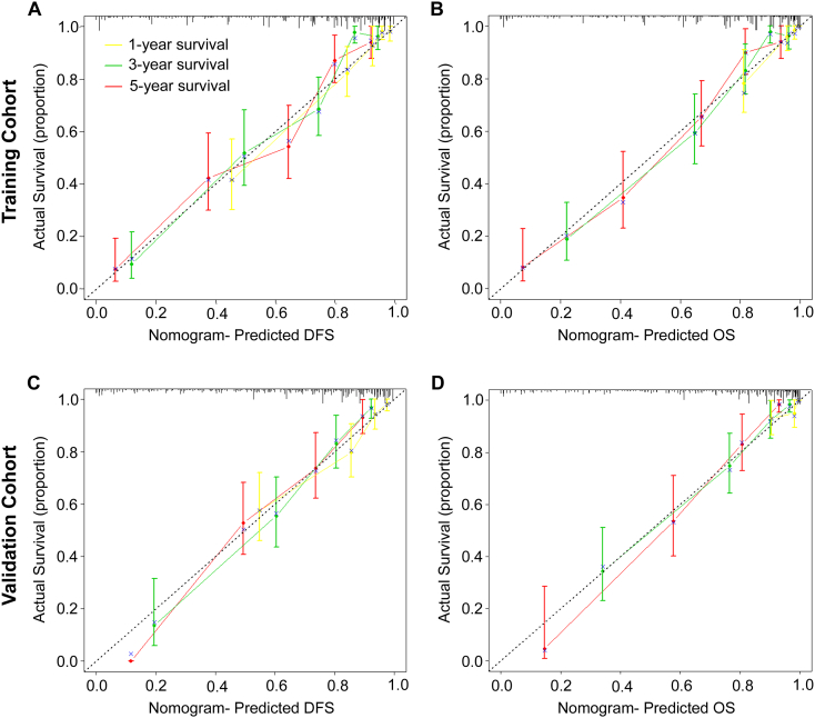
Figure 4.
Calibration curves for the nomogram. The calibration curve for predicting patient DFS (A, C) and OS (B, D) at 1-year, 3-year, and 5-year in the training and validation cohorts. Nomogram-predicted OS and DFS are plotted on the x-axis, and actual OS and DFS are plotted on the y-axis. The dotted line represents an ideal nomogram, and the solid blue line represents the current nomogram. The vertical bars are 95% CIs, and the ×s are bootstrap-corrected estimates.

