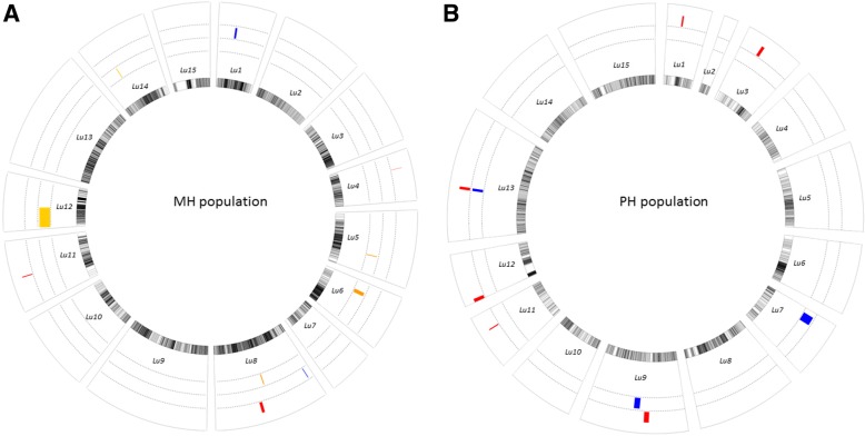
Fig. 4.
Graph of QTL mapping results for the two populations. a MH population. b PH population. The innermost circle represents 15 linkage groups, the outer circles represent QTL mapping results for plant height and technical length. Additional data about of the genetic maps can be found in Additional files 1 and 2. The circle with a red bar shows the QTLs for plant height, the circle with a blue bar shows the QTLs for technical length, and the circle with an orange bar shows QTLs detected for both of the traits

