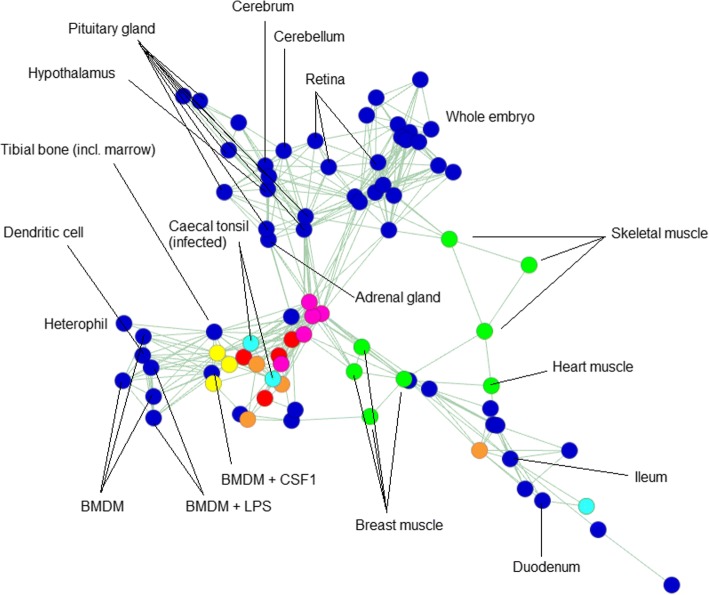
Fig. 3.
2D representation of a sample-to-sample network graph, plotting Spearman’s correlations between expression profiles. The graph was built using an RNA-seq meta-dataset with each sample distinct by tissue, developmental stage and BioProject of origin, and expression level per gene per sample averaged (where possible) across all replicates of that sample (dataset available as Additional file 6: Table S6). Each node (circle) in the graph represents a sample, and each edge (line) a correlation exceeding a threshold (rho ≥ 0.82). The graph contains 82 nodes, connected by 243 edges. Selected nodes are labelled. Overall, like tissues tend to correlate more strongly with like, irrespective of BioProject of origin. Certain coloured nodes indicate tissues independently sequenced by multiple BioProjects (listed in Additional file 2: Table S2), including liver (red), spleen (yellow), lung (orange), adipose (pink), caecal tonsil (light blue) and muscle (green). There are two notable idiosyncrasies: one of the four lung samples is comparatively dissimilar to the others of its group, as is one of the three caecal tonsil samples. In the latter case, however, the two most closely correlated caecal tonsil samples are those infected with Campylobacter. Consistent with this, these samples cluster more closely with immune cells and tissues. The third caecal tonsil sample belongs to a healthy chicken

